TBF, I hadn't read your post until now. You posted while I was typing... your thoughts seem similiar to mine, only much much nicer!
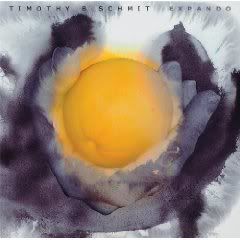
Yes, it's an orange! I saved the pic and then blew it up. It appears to look like Tim's fingers and an orange...


TBF, I hadn't read your post until now. You posted while I was typing... your thoughts seem similiar to mine, only much much nicer!
Yes, it's an orange! I saved the pic and then blew it up. It appears to look like Tim's fingers and an orange...


Shoot, you can barely read his name and title at the top. It's gray on gray.Originally Posted by timfan

Heck, if I had called my album "Expando" I would probably make it hard to read, too. I believe he's said that he chose it because it was Spanish for "I expand," and he felt like he was expanding beyond what he'd done before. Still, to many English-speakers (the main market demographic for the album), it sounds odd - at least from the response I've seen. To me, it sounds like a silly made-up word intended to make a plain word sound grander.
However, I truly think the reason for the small name and title is basically aesthetic. His wife has created this piece of art and he doesn't want to mess it up by slapping his name and album title across it.
Just guessing, but I think he gave his wife free reign to design whatever cover art she liked. I can see how thematically you could argue this fits because the mundane orange/hand photo is being "expanded" into something exotic by an alteration of its environment created by adding an artist's touch... an essentially post-modern approach. I say this because I figure it must be symbolic of something. I daresay she wouldn't slap a random image onto it. I guess we can all attribute to it whatever meaning we like, and my interpretation is no better than anyone else's.
Lots of albums have artistic cover art that sacrifices clarity of name and title for aesthetics, so this isn't terribly abnormal. Perhaps they think art will attract the eye more than just another photo of the artist, like so many other albums. Plus, he doesn't have face recognition like a lot of the people who choose to do their photo as the cover.
In light of that, I think it was a good choice to use art instead of his photo.
As to the choice of THIS art - well, frankly, to a lot of folks (myself included), postmodern art just looks downright weird. I mean no offense to those who like it, but it's not for me. However, even if you don't like it, your eye is drawn to it with its striking color contrast and unusual look - and that's all they want! Objective achieved!
Always in our hearts, Never forgotten
Soda-
I think you are giving it too much credit. My first thought went to my childhood... when they had those cards about tiolet humor. The card would look like the inside of a toilet flushing in black grey and white... looks VERY similiar to this!
If I saw that in a store, I'd pass it up. It does not "grab" me at all, but rather turns me away. I have no issue w/TBS not being on the cover... but his wife and daughter are both artists and surely they can come up with better than this! IMO!
My 2 cents..... I think it's very eye catching.
Compare it with the front cover of Strange Weather. At least it appears to be making some sort of statement.


I'm going to have to go with the majority here. It's pretty wierd. Can't say I like it at all. At first I thought it was an egg.
As far as promoting goes, what's he promoting? His wife, the artist or himself, the musician? Certainly not himself with this!
"They will never forget you 'till somebody new comes along"
1948-2016 Gone but not forgotten

I've seen some very harsh criticism of the cover. My opinion is, It's just fine.


While the cover art wouldn't have been my first choice, I prefer to wait and hear the CD...I believe in the old adage "You can't judge a book by it's cover"! I'm really much more interested in the music.
I just need a little downtime.........

Okay, have to add my two cents here. On first glimpse I thought it was the sunbut now I see the orange. It's pretty weird but I'm sure it must have some great meaning to Tim. I don't think it would really jump out at someone who is not a Tim/Eagles fan. Although I can see not wanting to cover the art work with your name/title I think it needs to be a bit more prominent than that. So we shall see. Anxious to hear the music.
Tim - start promoting this thing else who is going to know about it.

I must say my first impression of this cover was similar to many others: WTH? but as I have examined the cover art more I have grown to like it more and more. it is intersting and exotic and seems to be trying to show the meaning of the word Expando; as in expanding our minds beyond our comfort zones.... JMHO of course.
Last edited by timfan; 09-23-2009 at 04:39 PM.
Well Timothy's site has been updated... kinda! It still hasn't been changed to reflect the new album but it now refers to the August Contest winners on the front page rather than the July contest winners.
So perhaps they are waiting til the album is released to change the site.
 Posting Permissions

 Reply With Quote